Scholastic:
World Affairs Atlas & Almanac

The Task: Transforming a Popular Print Product
The World Affairs Atlas & Almanac - published annually in Junior Scholastic and The New York Times Upfront magazines - is beloved by teachers and students. The Atlas & Almanac contains data and maps, and are used in classrooms all year. As Scholastic Magazines' updated their websites, it was clear that this pivotal product needed a digital redesign.
The Opportunity: Creating an Interactive Digital Experience
The Atlas & Almanac was initially designed as a print product, which was put on the web in PDF form. Dense with information, this was not ideal for scanning large amounts of data online. In addition to making the content easier to read, my mission was to add interactive ways for students to explore the data and uncover new insights about the world around them.
Step 1: Asking Questions to Uncover Use Cases


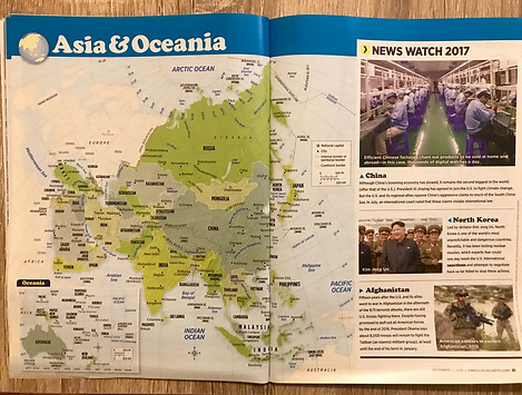
Pages from the print Junior Scholastic World Affairs Atlas & Almanac
Asking Crucial Questions
The editors at Junior Scholastic and The New York Times Upfront magazines were experts on the print version of the World Affairs Atlas & Almanac. We looked through it together, and I asked them questions to learn critical information about the publications, such as:
-
How did teachers and students utilize it in the classroom? What lessons were they teaching with it?
-
Why had they decided on the current system for organizing the data?
-
What were the differences between how it was published in Junior Scholastic (for middle school students) versus The New York Times Upfront (for high school students)?
• A teacher asks her class to compare literacy rates across countries to spark a discussion
• A team in Model UN is researching the country they're representing before a conference
• A teacher assigns homework from the workbook that accompanies the printed Almanac
• A student is writing a paper and wants to find a specific piece of data to defend a claim
Situations where students use the Almanac

Takeaway: I knew students needed to be able to compare/contrast data across countries while also viewing data by country. This required a nimble digital experience that would help students manage complexity and make sense of the content.
Step 2: Determining how to organize the data
Digging into the details
Before creating a UI, I developed a deep understanding of the content and data I was working with. The Almanac provides 14 data points about each of country. I split the data into quantitative and qualitative variables, and continued my explorations from there.
Discovery Tools
The Almanac contains close to 3,000 data points, and I had three tools I could use to help students find the exact information they were looking for: search, filter and sort. I thought through which tools were applicable to each type of data. For example, it would make sense to filter by continent but would not make sense to filter by Head of Government.


Creating Categories
I also realized the data could be organized thematically, which I knew might be another useful way for students to browse the Almanac. I create four theme-based categories:
-
Government
-
People
-
Geography
-
Well-Being
Tying it Together
Lastly, I looked back at the scenarios given by the editors and determined which methods of data organization would be most useful to middle and high school students. I wanted to include as many helpful tools as possible without adding any unnecessary features that might overwhelm the interface or the students interacting with it.
Step 3: Designing a Clean & Clear User Interface
Wireframe Options
I created two layout variations, each with a different interaction pattern.
Version A - Country Cards
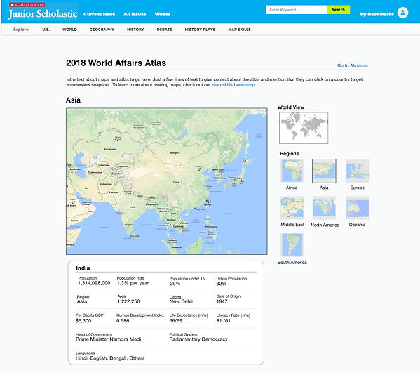
This version prioritized users who wanted to learn a lot about a single country, so each country was given it's own container

Users could expand the containers to see all the data about a particular country at once

Thematic Tabs - Version B
This version prioritized users who wanted to compare countries, listing all the countries in a single table

Users could view information by topic, using the tabs at the top of the table to navigate through the information

Step 4: Combining ideas to create a final design
Choosing the Solution
I showed my wireframes to the editors for feedback. Overall, they liked both concepts, but felt that Version B - the comparison charts - would be more useful to students and teachers. However, we didn't scrap Version A: instead, we incorporated it into the Atlas part of the project.
Atlas Wireframe

Refining the Details
The editors also provided some guidance on language, and refined the information architecture. With these changes in place, I passed the annotated wireframes off to our visual designers and developers.
Result
The project was shipped in November 2017! It's live on Junior Scholastic and the New York Times Upfront. The same design has also been used for Junior Scholastic's United States Atlas and Almanac.
Want to talk more about how I create educational tools?